


Agreed had built something genuinely valuable — a B2B SaaS platform that gives organizations a structured way to surface ideas, democratize decision-making, and move work forward between meetings. The founding team were already trusted voices in the consulting world. The methodology worked. The software wasn't keeping up.
New users were churning within the first three months. The onboarding was complex, the information architecture was difficult to navigate, and the UI wasn't doing enough to guide people through a product that required real organizational buy-in to succeed. When software asks that much of its users, the experience has to earn it.
I came in as a design partner from the early stages to diagnose what was breaking and rebuild it. That meant rethinking the information architecture, simplifying navigation, redesigning onboarding from the ground up, and creating a visual language that made a powerful product feel approachable — without dumbing it down.


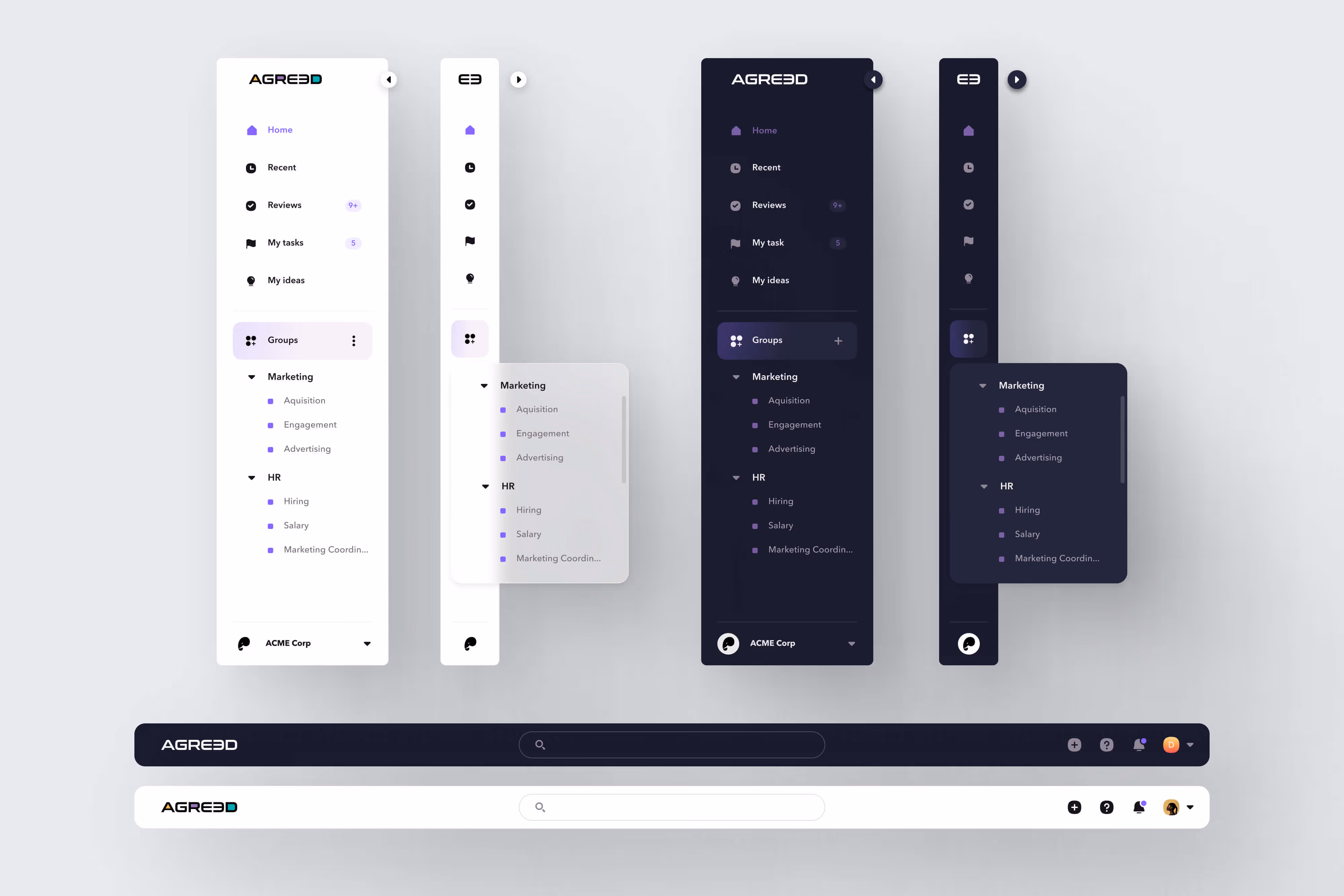
The first thing to solve was the underlying architecture.
Agreed needed to work for a five-person startup and a Fortune 500 company without feeling like a different product for each. That meant designing a framework flexible enough to scale to any organizational shape — without adding complexity for users who didn't need it.
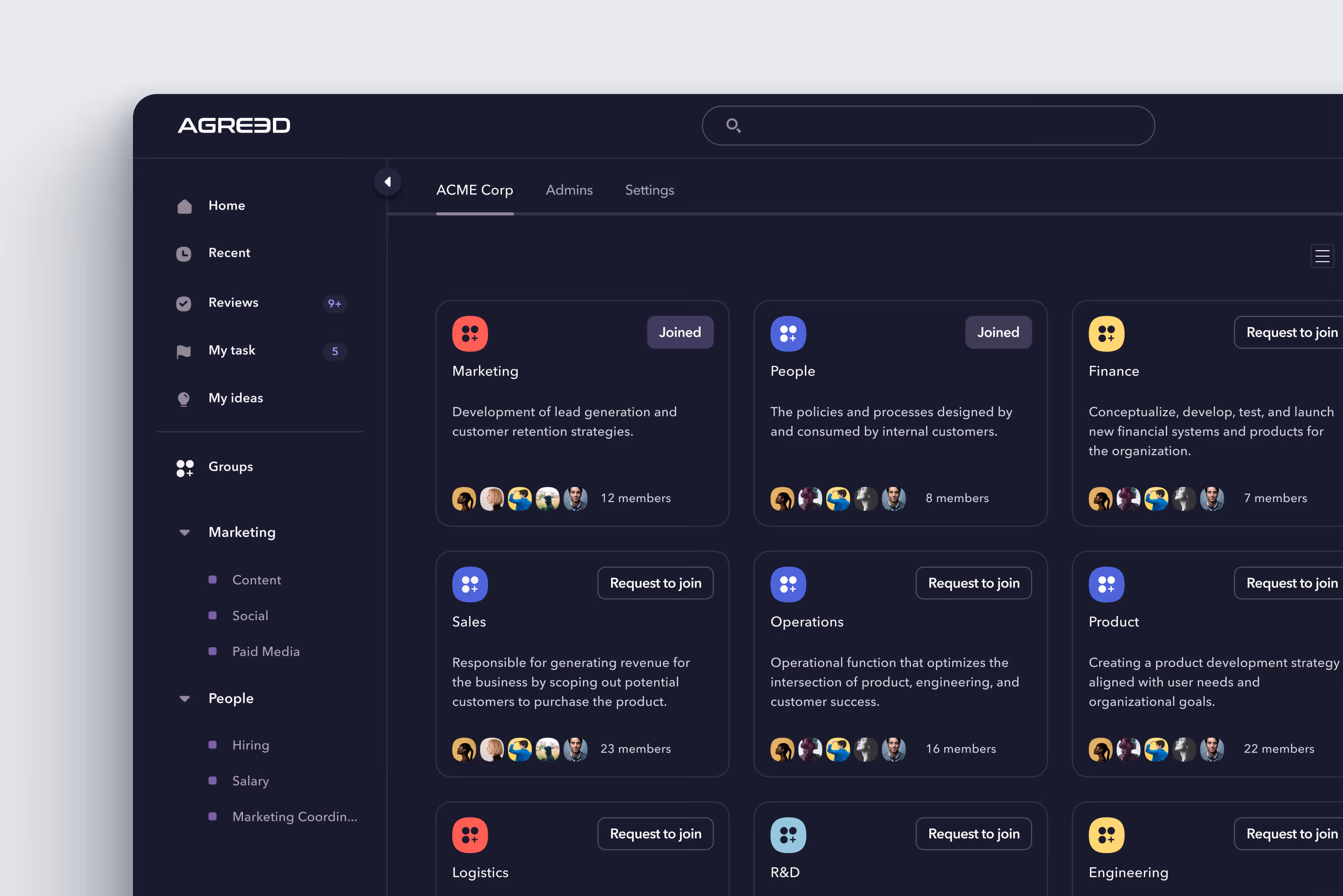
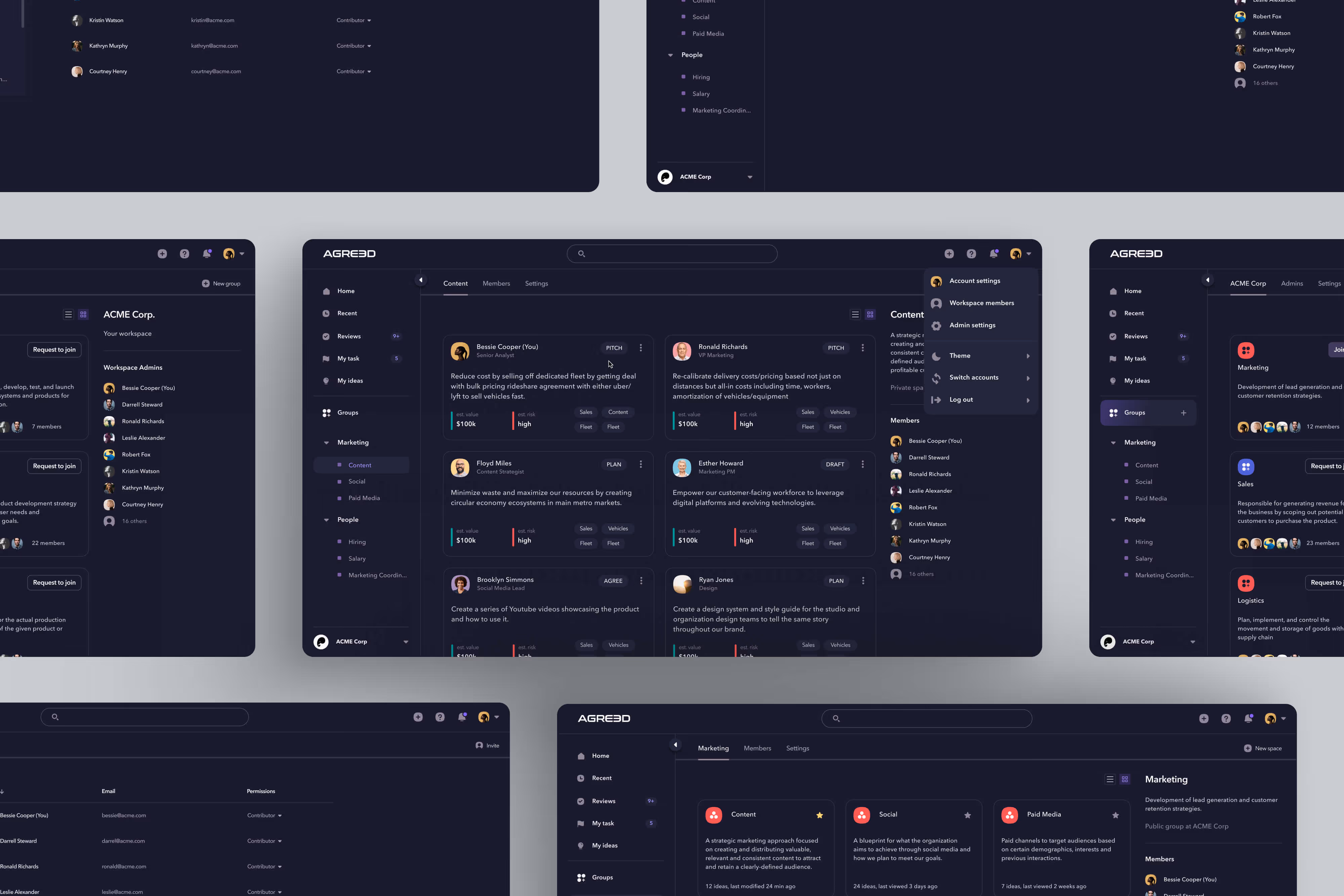
The answer was Workspaces and Groups — a structural layer that gave organizations a way to house everything from a single team's ideas to company-wide initiatives. But structure alone wasn't enough. The harder problem was access. Who sees what. Who can contribute. Who decides.
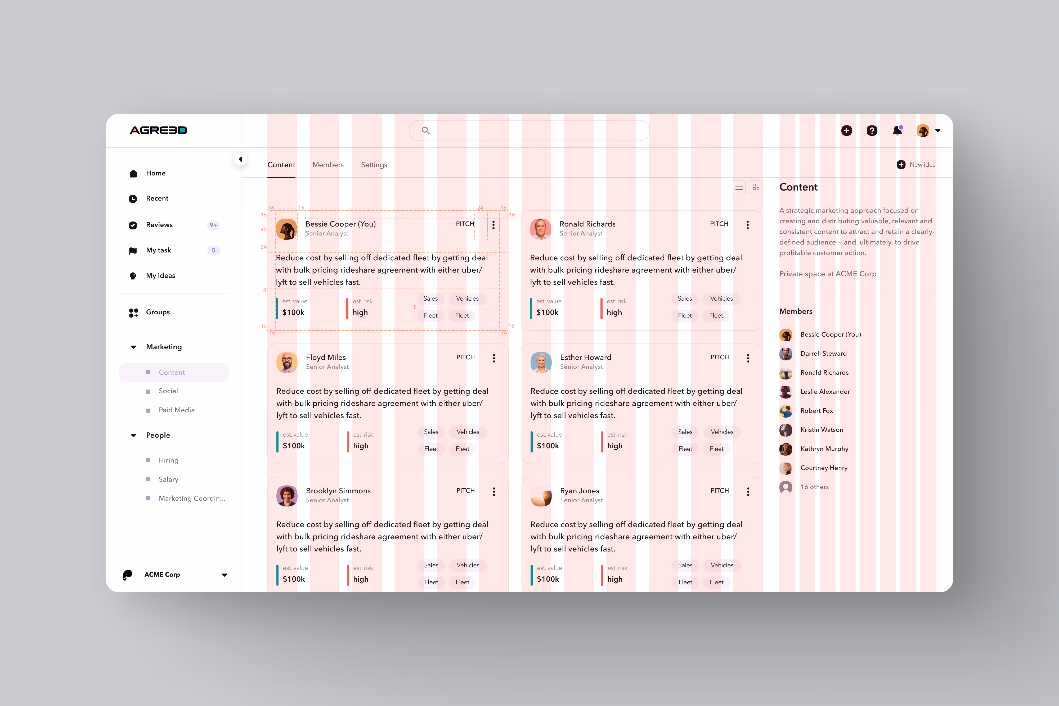
The roles and permissions framework became the backbone of the product. Users are assigned both a seat and a role — viewer or maker, combined with admin, member, or guest. Simple enough to set up on day one. Flexible enough to govern an enterprise. Getting that matrix right meant the product could be deployed org-wide without IT involvement becoming a bottleneck.
From there, the visual design had a clear mandate — make powerful software feel human. Enterprise tools don't have to be beige. Color and contrast were used deliberately to signal hierarchy, guide attention, and make collaboration feel like something worth showing up for.
The onboarding was rebuilt last, once the architecture was solid. The new flow guided users directly to two actions: invite their team and create their first idea. Everything else could wait.


.jpg)

Most organizations don't lack good ideas. They lack a way to surface them. That's what Agreed was built to solve.
A redesigned architecture that scales from startup to enterprise. A permissions framework that gives organizations control without creating friction. An onboarding flow that gets users to their first meaningful action before doubt sets in. And a visual language that makes collaboration feel less like a meeting and more like momentum.
The best B2B design doesn't announce itself. It just makes people feel capable. When the software gets out of the way, the methodology can do what it was always meant to do.
For me, Agreed represents a particular kind of design challenge — the kind where the problem isn't what the product does, but whether people can actually access what it offers. Untangling that, building the right structural foundation, and creating an experience that earns organizational trust is work I find genuinely interesting. This project showed I could do it.