


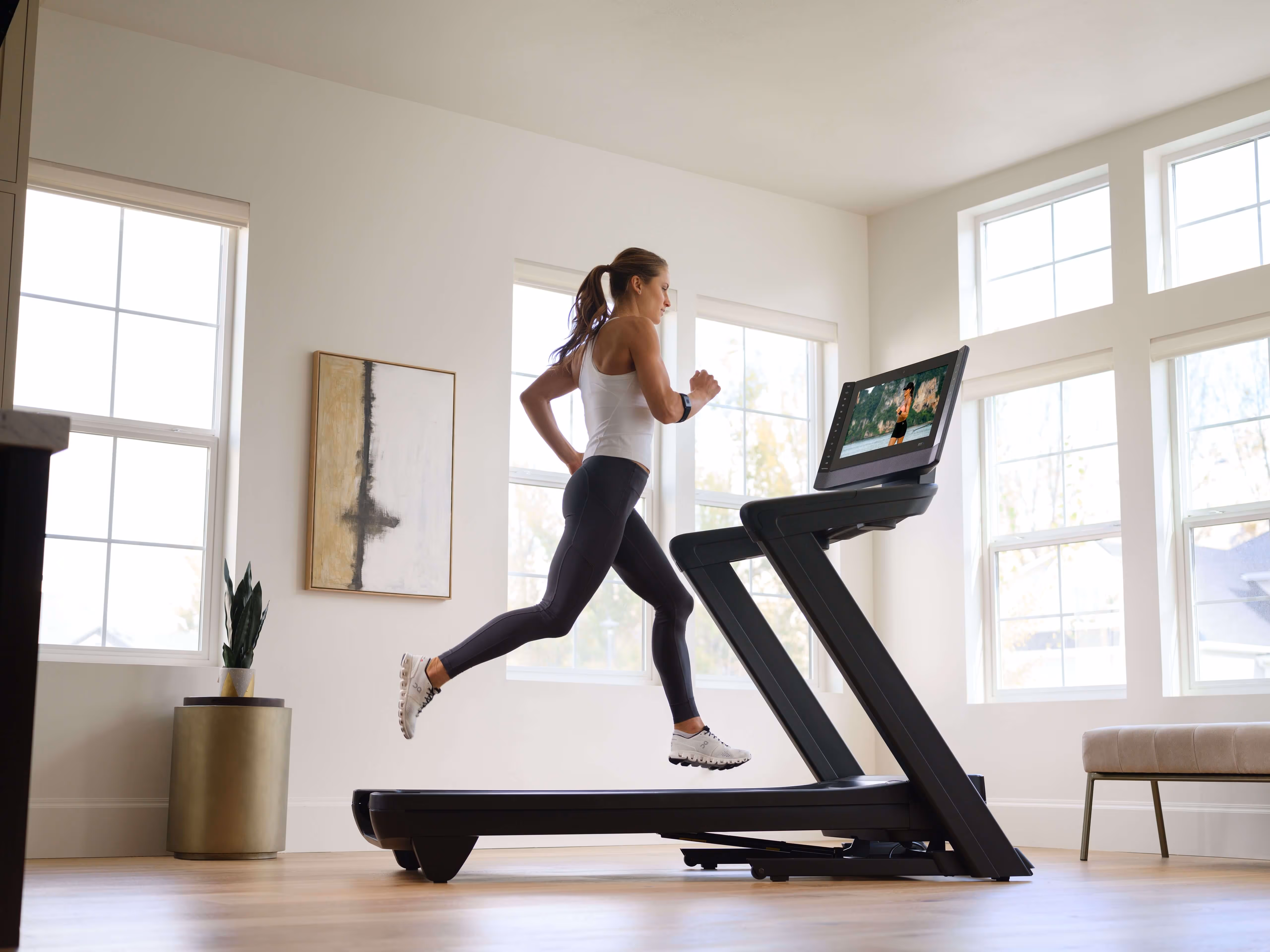
iFIT gives members access to 20,000+ trainer-led workouts filmed around the world. By 2022, that content library had grown faster than the platform built to hold it. The workout experience was technically fragmented — a mix of native and web view components built on an outdated framework — and the UX had compounded over years of additions without a coherent system underneath. The brief was to redesign the core workout experience for 6.4 million users without breaking what was already working for them.

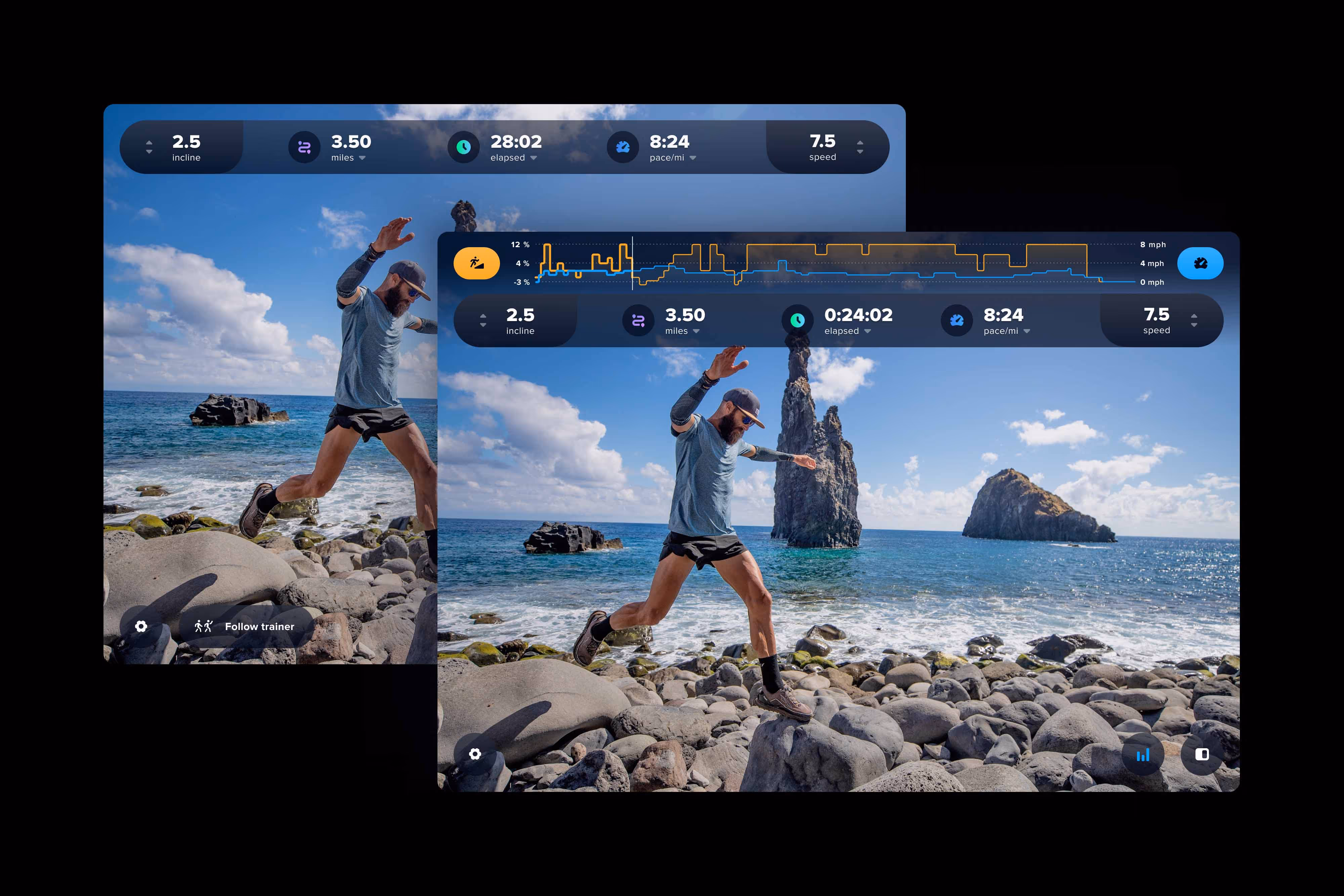
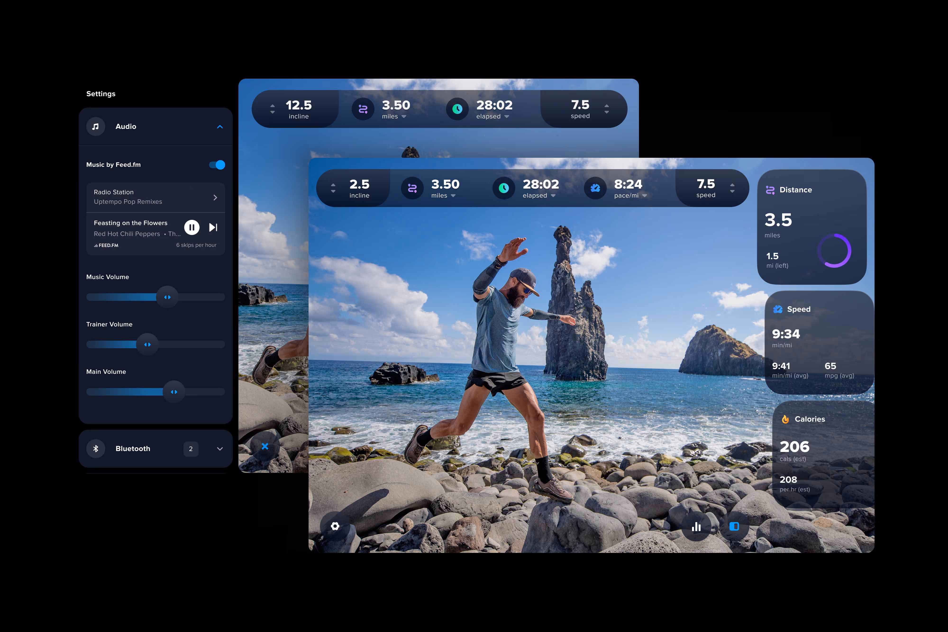
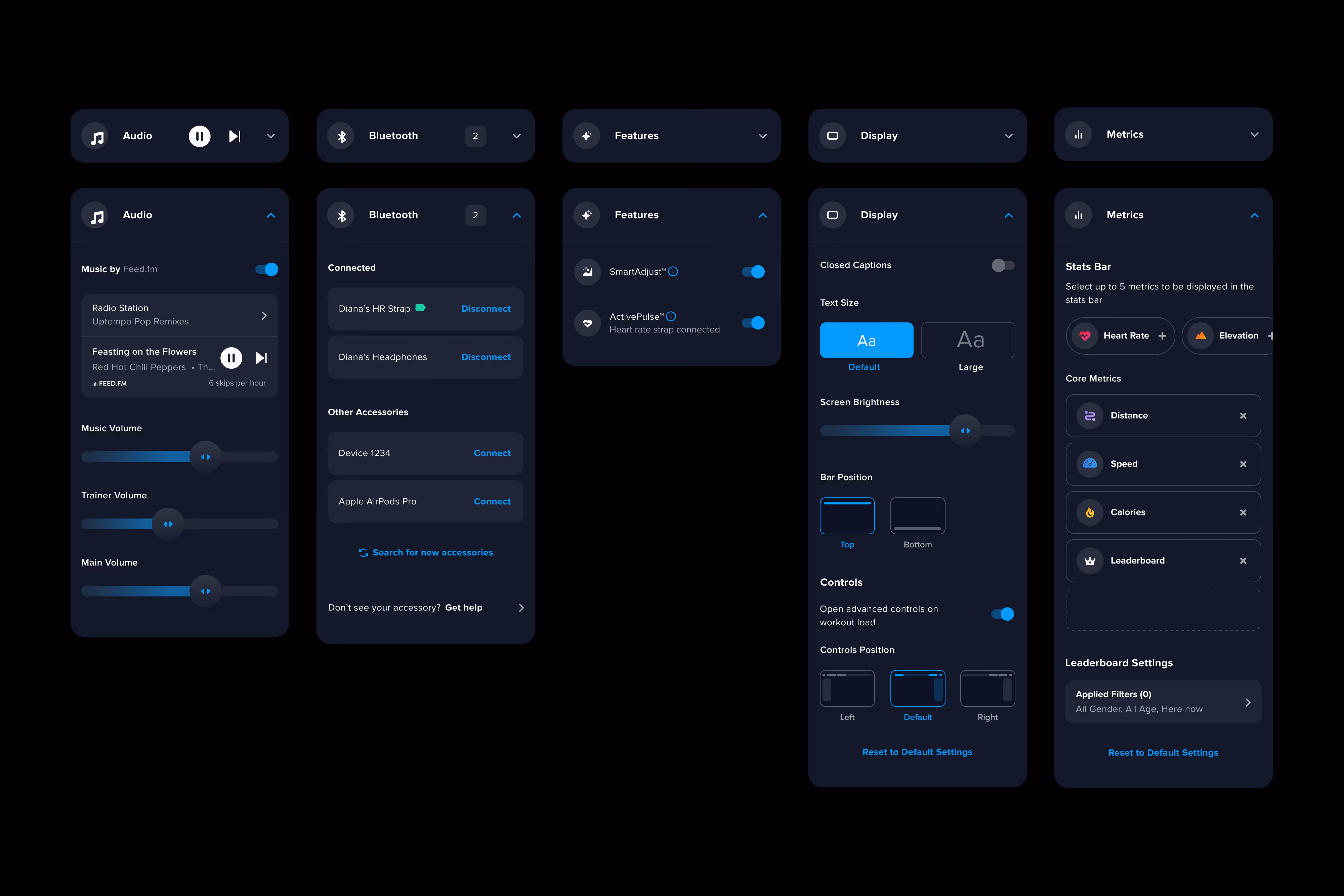
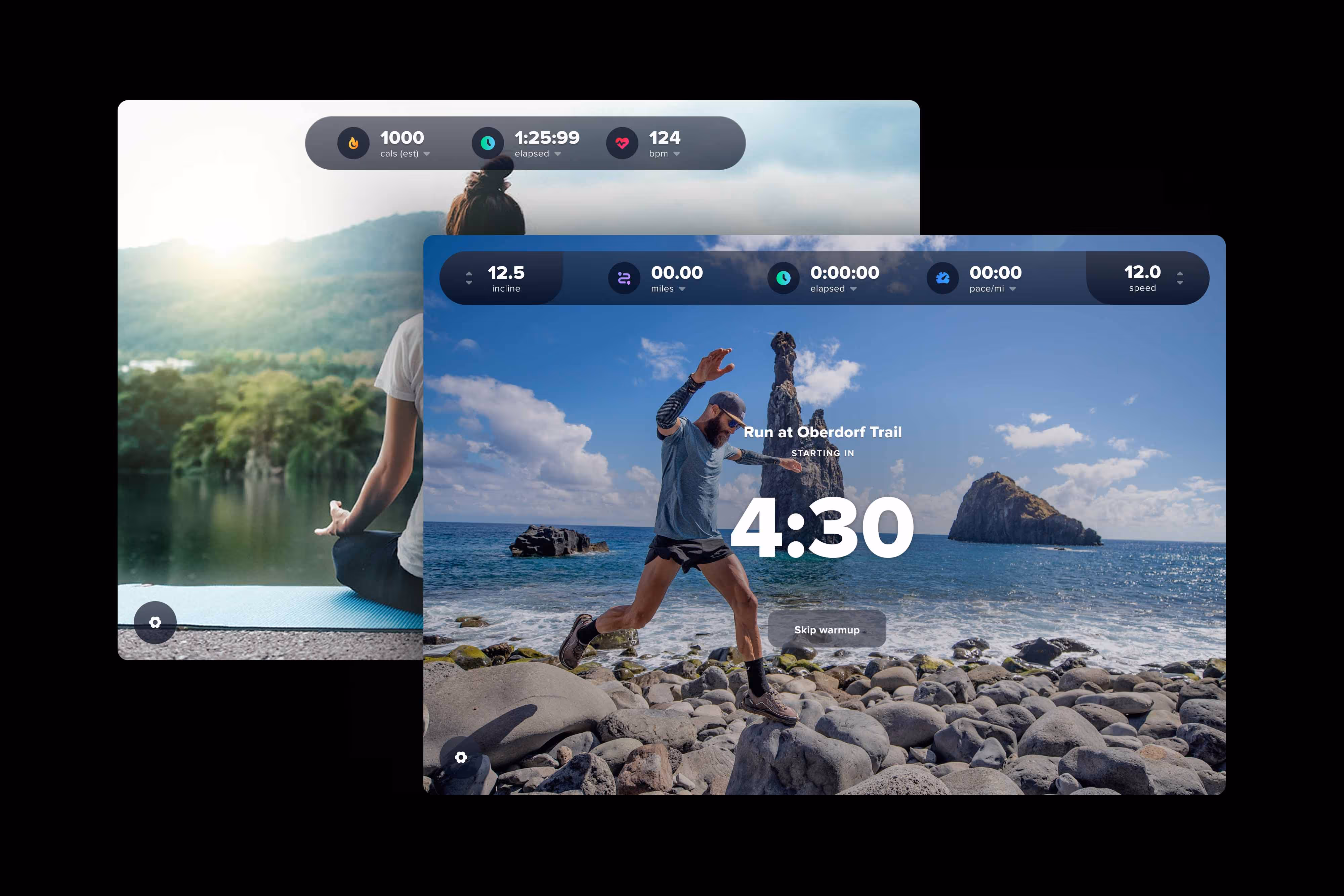
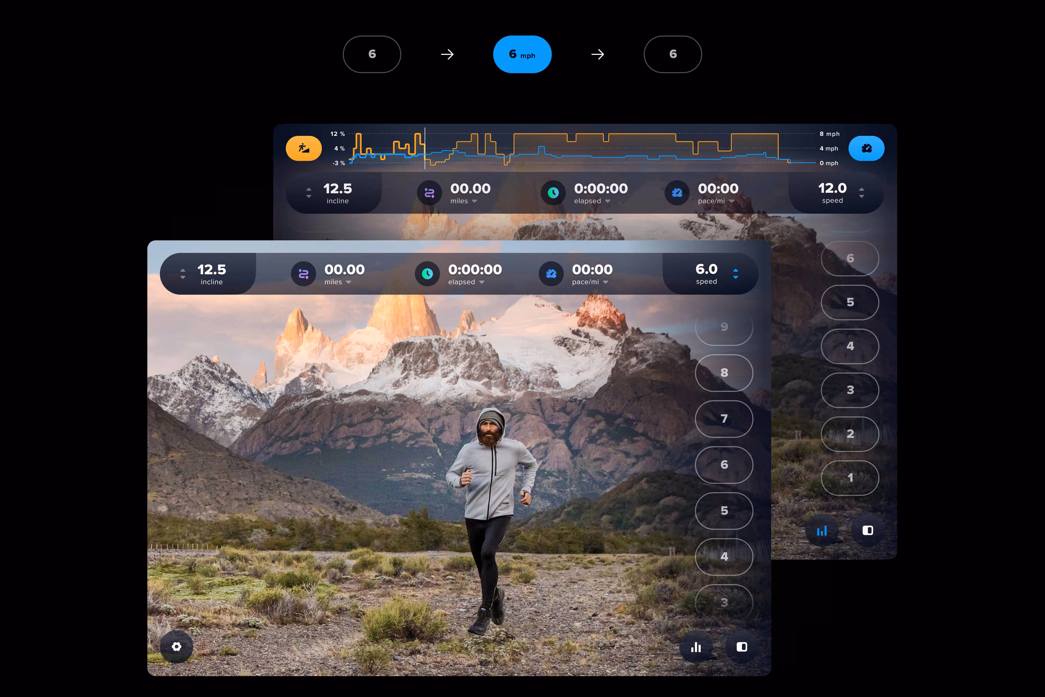
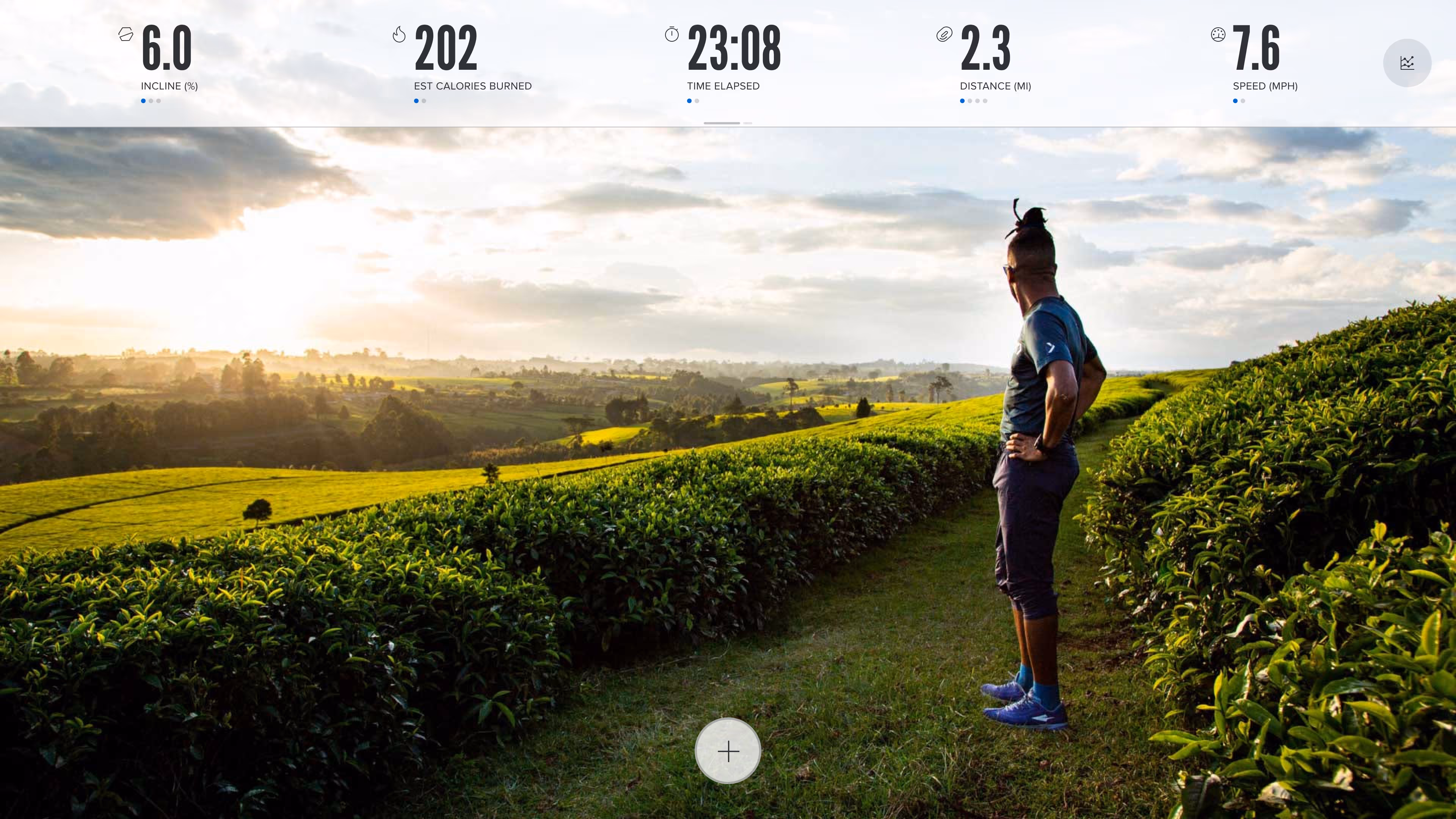
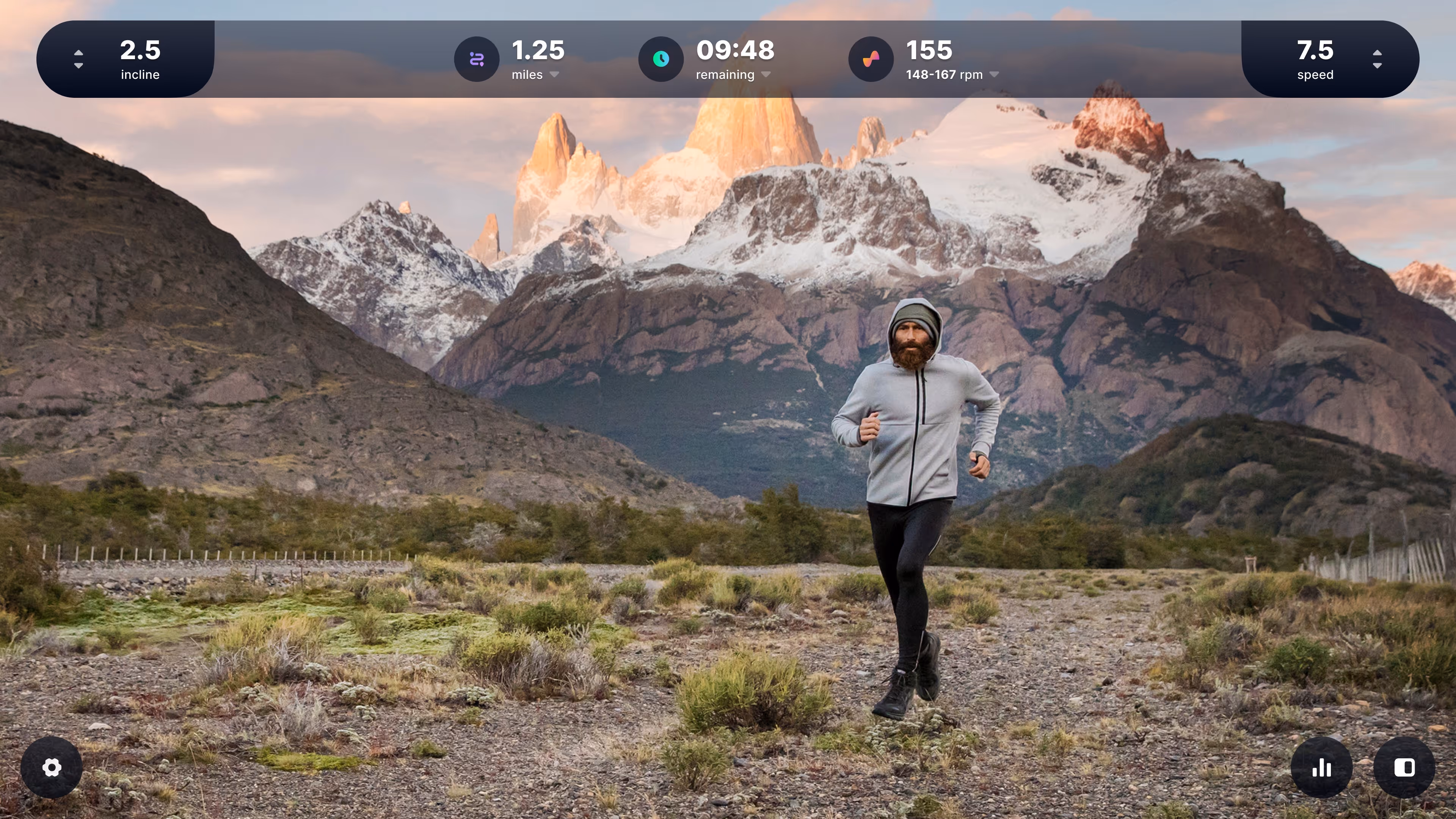
The redesign introduced a modular workout interface — members could choose how much or how little information they wanted on screen, depending on whether they were training for an event or just trying not to think about the pain. Color and micro-interactions were added not for decoration but for awareness, accessibility, and fatigue reduction. Controls were grouped by location and reachable with minimal eye or hand travel.
The most requested change from members was simpler: get out of the way. We made components smaller but more legible, transparent but with contrast, and built in moments of encouragement timed to when people were most likely to quit. After launch, workout completion rates improved from 61% to 75%. Session start time dropped by 84% — from over six minutes to under one. Both changes were directly traceable to interaction decisions made during this project.